WaiPRACTICE

WaiPRACTICE October 2020
View the Project on GitHub women-in-ai-ireland/October-2020-WaiLEARN-Detecting-COVID-19
Contributors
Buvana Ganesh | LinkedIn|GitHub Meghana Rathi | LinkedIn|GitHub Noreen Lenihan | LinkedIn|GitHub
Deep Learning for detecting COVID-19 using Chest X-Ray Images
Noreen Lenihan, Meghana Rathi, Buvana Ganesh
We would like to acknowledge and thank the WAILearn initiative to work hands-on with AI from Women in Artificial Intelligence Ireland group for providing the opportunity to collaborate on this project over October and November 2020.
Background
Have you had a COVID-19 test or heard from someone about it and wondered if there was another way to test? If something already available in hospitals can be re-utilised for COVID-19 testing, then it is possible to test on a larger scale. In this project, we look at chest X-rays and check their viability for detecting Covid-19. Given the unanimous success of deep learning for image classification, we investigated the potential of Convolutional Neural Networks for differentiating between COVID and non-COVID diagnosis in X-rays, in particular, distinguishing between COVID and other pneumonia types, as well as between COVID and healthy patients.
About the dataset
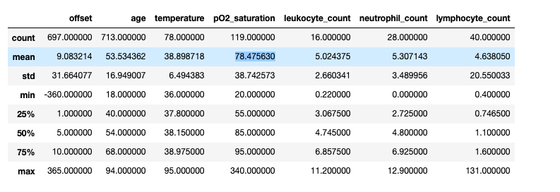
We leveraged an open dataset from (Cohen) by Joseph Paul Cohen. This dataset was constructed by scraping academic papers on Pneumonia and COVID-19. It contains 950 images with mostly PA, AP and Supine views. It is accompanied by a metadata CSV file. The metadata has 30 descriptive columns available on each of the cases, for 472 unique patients. A high-level overview of some summary statistics of the numeric columns is shown below.
Labels
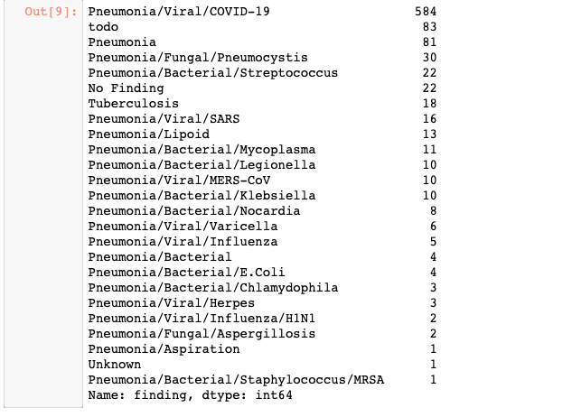
The current dataset contains the following labels as diagnosis.
As seen from the above image showing the breakdown of classes, there are 83 records with a ‘todo’ label, 22 records with a label of ‘No Finding’ and 1 record with an ‘Unknown’ label, implying that the condition is unknown for these patients. We performed some fundamental data analysis of the metadata and drew insights about what was available for further analysis.
COVID to Non-COVID cases:
If the undefined cases are removed, we are left with 584 cases of COVID-19 and 260 cases of non-COVID outcomes. When we look into the breakdown of cases across gender, there is a slightly higher incidence among males, with almost double the number of males being diagnosed with COVID-19 compared to females.
Looking at the offset, patients who have a COVID-positive diagnosis presented on average 4 days later at a hospital, whereas it took non-COVID patients 8 days to present. This could potentially be due to the fact that COVID-positive patients had more severe symptoms and thus were admitted to hospital sooner.
Finally, in terms of survival for those diagnosed with COVID and other Non-COVID conditions, we observe a larger number of COVID-positive patients who do not survive, compared to non-COVID patients. However, there are only 120 values for ‘survival’ in the cleaned dataset, with the remaining outcomes unknown.
The notebooks and
give a detailed visualisations on the metadata.
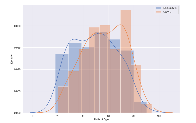
Age Distribution of Patients
We can observe from the distribution plot below, that the largest density of patients are in the older age profiles, between 50 and 60 years of age, with a peak between 70 and 80 year olds.A further breakdown of the age distribution by COVID/Non-COVID diagnosis shows a slightly larger density among the older age profiles for COVID-positive patients. In fact, the mean age for non-COVID patients presenting was 49 years old, and for COVID-positive patients it was 57 years of age.
Our initial intention was to perform a binary classification of COVID and Non-COVID classes based on the metadata. Unfortunately, the high percentage of missing data in this dataset meant this was not a viable endeavour.
Classifying Covid vs Normal Images
In order to see if we can correctly predict a positive covid-19 case from a normal i.e. no respiratory condition case, we decided to use a dataset which contained 191 x-ray images of healthy patients with no respiratory illness and 191 x-ray images of covid-19 positive patients. The x-ray images for healthy patients was sourced from the dataset by Mooney (Mooney). The x-ray images for covid-19 positive patients was sourced from the original dataset (Cohen) , by scanning through the metadata.csv file to take images that had the ‘finding’ label of ‘Pneumonia/Viral/COVID-19’ and ‘PA’ view.
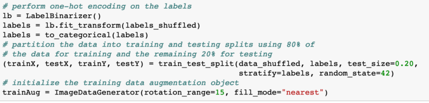
Once the data gathering step was complete we decided to implement a VGG-16 model to test how accurately it can predict a covid-19 positive patient from a healthy patient. The first step in implementing the model was to initialise the learning rate, epochs and batch size which we found to be 1e-3, 7 and 8 respectively to give optimum results. Next we split the shuffled image data and labels by allocating 80% of the data to training and 20% to testing as seen in the code snippet below.
We then instantiated the VGG16 network with weights pre-trained on ImageNet but constructed a new fully-connected layer head and froze the weights of the VGG16 so that only the fully-connected layer gets trained. The way this was done can be seen in the code below.
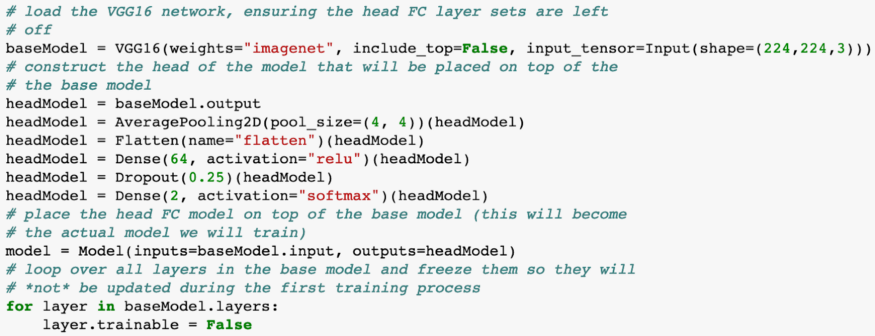
We use Adam as the optimiser and binary cross-entropy as we only have 2 classes to classify, covid-19 positive or healthy, to compile our model. This model was trained and we achieved approximately 98% accuracy on our validation set from this model. Note: The work in this section was based of this tutorial (Rosebrock)
Covid vs Non Covid lung diseases
The same set of images with PA view for the Covid Dataset is used but instead of the “Normal” dataset, we use the rest of the original dataset(https://github.com/ieee8023/covid-chestxray-dataset) with 920 images by Cohen et al. The dataset is split as Covid and Non Covid and then split into Train, Test and Validation sets in a 80:10:10 ratio using the split_folders library or train_test_split. This dataset is then preprocessed for uniformity color and dimensions and fed into the Neural network.
For the CNN, the same approach as above is employed with a sequential five layered convolutional neural network. This gives an accuracy of about 64 to 65% with Adam optimiser, running 10 to 20 epochs, and lr_reduce method using the learning rate of 0.01. Pretrained models, namely VGG16, Resnet and Inception, improve the accuracy and achieve 65 to 69% validation accuracy, based on how well the dataset is randomised.
We can clearly see that the Covid vs Normal dataset performs better because the CNN detects congestion, but Covid vs Non Covid cannot be classified with higher accuracy until dataset size improves significantly
Explainability - What was the CNN looking for?
One way to know where the CNN was not performing well is to visualise the layers of the CNN. We find that the layers focus on the parts in the lungs that do not have congestion. We also use the decode predictions method from Keras for explainability.
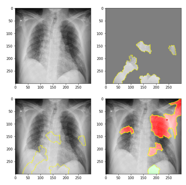
LIME (Locally Interpretable Model-Agnostic Explanations)
LIME is a library with rich features for exploring why neural networks take certain decisions. We used the LIME package on 1 sample of a COVID-positive image and produced the following results. In the top left, we see the original image. In the top right, we delineate the pieces of the image that contributed to the COVID classification using the CNN. In the bottom left, we again see these areas that support a COVID classification in the overall image. Finally, in the bottom right, we can see the parts of the X-ray image that did not support a COVID-positive classification. For further details on applying the LIME package to these images, refer to the Jupyter Notebook.
Activation Maps
Now that we had a working image classification model that can quite accurately predict from an x-ray image of the lungs if a person has covid-19, we wanted to see the inner workings of our model and understand how it is able to detect covid-19. We decided to use keras library to visualise feature maps of our previously trained model. Note: The notebook with workings can be found in this link Notebook
Feature maps essentially capture the result of applying filters to the input image. By visualising these feature maps we can see what features of the input image are preserved or detected in the feature maps.
We first load our previously trained model(covid-19 vs normal) and a single input image we wish to run through our model and see the feature maps for. This input image is converted to a numPy array and pre-processed so that it is scaled appropriately for the VGG model. Lastly we used the model.predict() function to obtain the feature maps, some of which we can see below, for our input image
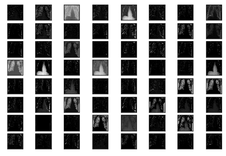
We can see in the above feature maps the different parts of the x-ray image that were preserved and detected by our model to make the final decision of whether the individual has covid-19 or is healthy. (Brownlee)
Conclusion
Although achieving very high accuracy using CNNs for distinguishing between COVID and healthy X-ray images, we must remember that we can’t rely on X-ray imagery alone for COVID diagnosis. However, it is a useful starting point and something that could assist medical teams in formulating a diagnosis using this tool. Through collaborating on this project together, it has given us a renewed optimism for solving such high-stake real-world problems by seeing researchers collect and openly share data allowing researchers to team up across the world to solve common problems. Relatedly, we learned about the importance of model explanabilty in such a domain - it is critical to enable trust and give confidence to end users in this application domain, where the cost of a false positive is much lower than a false negative. We learned some pitfalls in data preparation where not shuffling images appropriately in the training dataset lead to suboptimal outcomes. Overall, ongoing and significant data collection and coordination of researchers will lead to larger training data and improved accuracy. Marrying medical classification with artificial intelligence is a fascinating endeavour and as a WAILearn group, we all learned something new in the realm of CNNs and COVID. We are grateful to have gotten to know each other in these strange times through a common interest in the fascinating world of AI and its vast potential in fields like medical diagnosis.
References
Brownlee, Jason. How to Visualize Filters and Feature Maps in Convolutional Neural Networks, https://machinelearningmastery.com/how-to-visualize-filters-and-feature-maps-in-convolutional-neural-networks/.
Cohen, Joseph Paul. “Chest X-ray dataset.” https://github.com/ieee8023/covid-chestxray-dataset.
Mooney, Paul. “Chest X-ray Images: Pneumonia.” https://www.kaggle.com/paultimothymooney/chest-xray-pneumonia.
Rosebrock, Adrian. “Detecting COVID-19 in X-ray images with Keras, TensorFlow, and Deep Learning.” https://www.pyimagesearch.com/2020/03/16/detecting-covid-19-in-x-ray-images-with-keras-tensorflow-and-deep-learning/.